HTML ERB Widgets
Collection of HTML snippets to standarize some markup commons
Readmore
This widget allows to wrap large texts with a read more/less link in order to expand or collapse the full content with a smooth animation
Preview

Collapsed

Expanded
How to use
Insert this snippet into an HTML template
<%= render partial: 'shared/widget_read_more', locals: {

          snippet: "Short text (or paragraph) to be always rendered",

          hidden_text: "The rest of the text."
} %>
Options
snippet: The text which laways be presenthidden_text: The rest of the text
Note the hidden_text does not contain the snippet part
Horizontal carousel
This widget wraps a bunch of containers/images in a interactive carousel
Preview

How to use
<%= render layout: 'shared/widget_horizontal_carousel', locals: { items: 2 } do %>
  <img src="" />
  <img src="" />
  <img src="" />
  <img src="" />
  <img src="" />
<% end %>
Note you may add any block of code between the tags
Options
items: How many items would be rendered in the visible frame
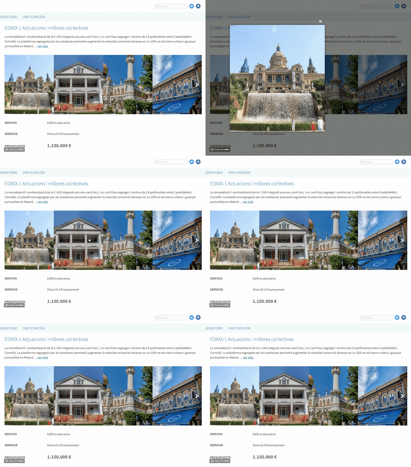
Image lightbox
This widget triggers a lightbox for an image or some markup containing an image. It uses magnificPopup on the background.
Preview

Open images on click
How to use
Simply add .js-image-lightbox to the element itself.
<!-- img tag -->
<img class="js-image-lightbox" src="" />

<!-- link with img -->
<a class="js-image-lightbox" href="">
  <img src="" />
</a>

<!-- wrapper with some other elements -->
<div class="js-image-lightbox">
  <h1></h1>
  <img src="" />
</div>
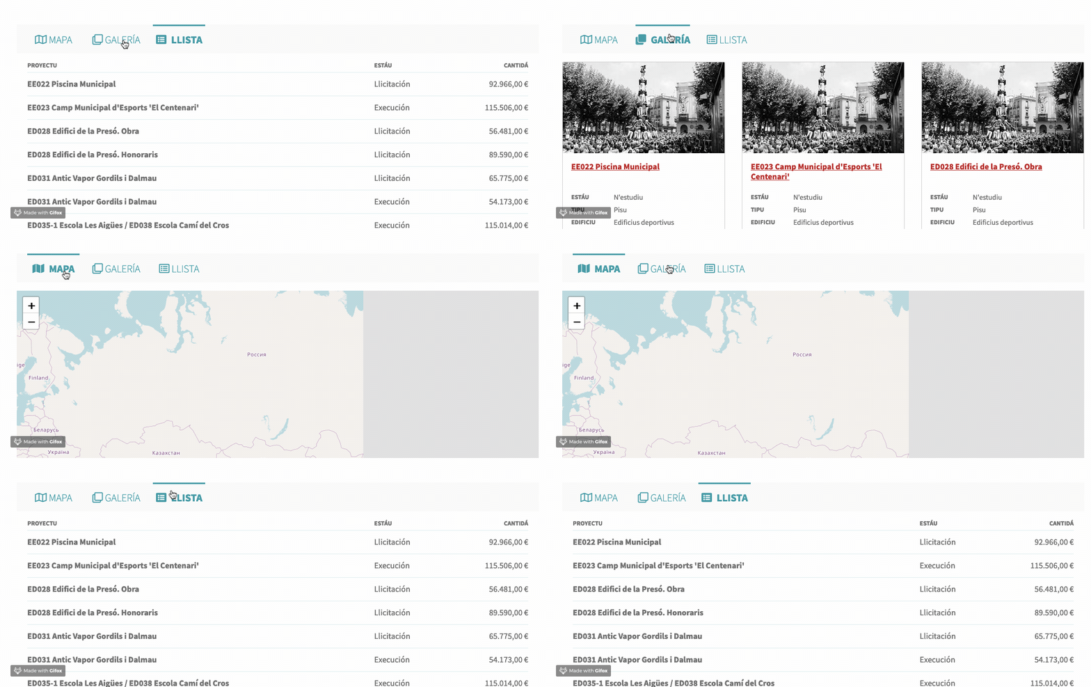
Tabs
This widget adds the tab functionality between distinct elements placed on the website, according to a simple HTML
Preview

Turn between tabs from the navigation links
How to use
The main point here is to idetify what tablinks (navlinks) and what tabcontent are related each other. To do so, we need to append a "seed" to the role tag, in that way:
<ul role="tabs-4j32n5kj23nj5">
That seed could be whatever string, usually an hexadecimal value generated like so:
<% seed = SecureRandom.hex %>
Now, we link that seed to the container where the contents live, as:
<div role="tabscontent-4j32n5kj23nj5">
Notice that we have only linked the containers. Now it's time to indicate what are the tablinks who will trigger the tab content updates. Just simple as append role="tablink" to the triggers and role="tabcontent" to the contents.
Requirement
The script toggles is-active class, both actives navlink and tabcontent, so you must add your styles properly in order to handle both visible/hidden states.
Full code sample
<!-- BASIC STYLES -->
<style>
[role^="tabscontent"] [role="tabcontent"] {
  display: none;
}
[role^="tabscontent"] [role="tabcontent"].is-active {
  display: block;
}
</style>

<!-- NAVIGATION LINKS -->
<ul role="tabs-2345678">
  <li role="tablink">
    Tablink 1
  </li>
  <li role="tablink">
    Tablink 2
  </li>
  <li role="tablink">
    Tablink 3
  </li>
</ul>

<!-- CONTENT -->
<div role="tabscontent-2345678">
  <div role="tabcontent">
    Tabcontent 1
  </div>
  <div role="tabcontent">
    Tabcontent 2
  </div>
  <div role="tabcontent">
    Tabcontent 3
  </div>
</div>
Note each link will display the content in that position. So the second link, will display the second tab.
For that reason, place your html in the same order as your links
Updated about 5 years ago
