Vue components Catalogue
Includes the table component.
Catalogue of Gobierto Vue-Components
Block Header
Displays a title with an extra clickable link-button to selectAll or selectNone

Props
title: {
  type: String,
  default: ""
},
seeLink: {
  type: Boolean,
  default: false
},
labelAlt: {
  type: Boolean,
  default: false
}
title: The text to render
seeLink: Flag to display the link-button
labelAlt: Flag to toggle between the link-button texts
Events
selectAll: void
This callback, with no return data, just informs to the parent container if the link-button has been clicked.
How to use
<BlockHeader
  :title="title"
  :label-alt="isAlternative"
  :see-link="isShown"
  @select-all="callback"
/>
Calendar
Instanciates an air-datepicker calendar.
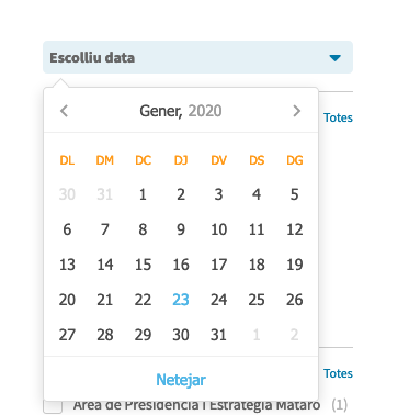
Props
savedStartDate: {
  type: Date,
  default: null
},
savedEndDate: {
  type: Date,
  default: null
}
savedStartDate: Load a default starting date
savedEndDate: Load a default ending date
Events
calendarChange: Object
It returns the selected dates when the user makes click on the calendar days.
{
  start: Date,
  end: Date
}
How to use
<Calendar
  :saved-start-date="new Date()"
  :saved-end-date="new Date()"
  @calendar-change="callback"
/>
Checkbox
It renders a checkbox with a title and a counter, and it handles the checked status.

Props
title: {
  type: String,
  default: ""
},
id: {
  type: Number,
  default: 0
},
checked: {
  type: Boolean,
  default: false
},
counter: {
  type: Number,
  default: 0
}
title: The text to render
id: An identifier for the checkbox, to toggle status on the label
checked: Flag to mark/unmark the checkbox
counter: Adds a number behind the title
Events
checkboxChange: Object
It returns an object with an identificator (who is the element) and the current checkbox status
{
  id: Number,
  value: Boolean
}
How to use
<Checkbox
  :id="number"
  :title="title"
  :checked="isChecked"
  :counter="number"
  @checkbox-change="callback"
/>
Horizontal Carousel
Vue version of the horizontal carousel. It sets in a row a bunch of images, showing navigation arrows to back and forth between the images.

default style
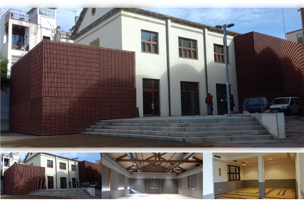
thumbnails mode
Props
visibleItems: {
  type: Number,
  default: 3
},
thumbnails: {
  type: Boolean,
  default: false
}
visibleItems: The amount of items to show in the display
thumbnails: Highlight one picture and display the rest of images beneath it as thumbnails
Events
None
How to use
<HorizontalCarousel :visible-items="visibleItems" :thumbnails="true">
  <img src="" />
  <img src="" />
  <img src="" />
</HorizontalCarousel>
Loading
Implements a spinner.
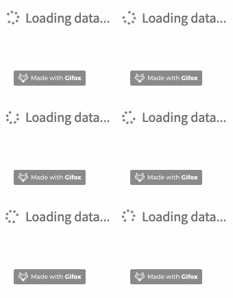
Props
message: {
  type: String,
  default: ""
}
message: The text to display
Events
None
How to use
<Loading
  :message="message"
/>
Range Bars
It displays a range selector, outputting bars
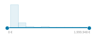
Props
min: {
  type: Number,
  default: 0
},
max: {
  type: Number,
  default: 100
},
total-items: {
  type: Number,
  default: 1
},
savedMin: {
  type: Number,
  default: null
},
savedMax: {
  type: Number,
  default: null
},
histogram: {
  type: Array,
  default: () => []
}
min: minimun value of the whole range
max: maximum value of the whole range
total-items: the total items inside the range
savedMin: sets a selected minimun value
savedMax: sets a selected maximun value
histogram: Array of objects to build the bars. It requires a id, a count (number of items for that group), a start and end value (bar range limit)
Events
rangeChange: Object
It displays a range selector, grouping values into a user-defined number of bars. Besides, it includes a slider to pick the desirable range.
{
  min: Number,
  max: Number
}
How to use
<RangeBars
  :range-bars=""
  :min="number"
  :max="number"
  :saved-min="storedNumber"
  :saved-max="storedNumber"
  :total="numberOfBars"
  @range-change="callback"
/>
Read More
Crops large texts as of certain number of chars, appending a text-buttons to toggle it.

Props
seeMore: {
  type: String,
  default: I18n.t("gobierto_common.vue_components.read_more.more")
},
seeLess: {
  type: String,
  default: I18n.t("gobierto_common.vue_components.read_more.less")
},
roundChars: {
  type: Number,
  default: 150
}
Note: the I18n default values contain: See more and See less for english language
seeMore: The text to display when the text is cropped
seeLess: The text to display when the text is full-shown
roundChars: Limit to displayed chars on cropped mode.
Events
None
How to use
<ReadMore :round-chars="300">
  Very long text. Very long text. Very long text. Very long text.
</ReadMore>
Dropdown
Wraps elements into an sliding dropdown. Toggleable on click.

Props
None
Events
is-content-visible: Bool
Returns wheather the content is visible or not
How to use
      <Dropdown @is-content-visible="callback">
        <template v-slot:trigger>
          Text or HTML (always visible)
        </template>

        Text or HTML. My hideable content
      </Dropdown>
Pagination
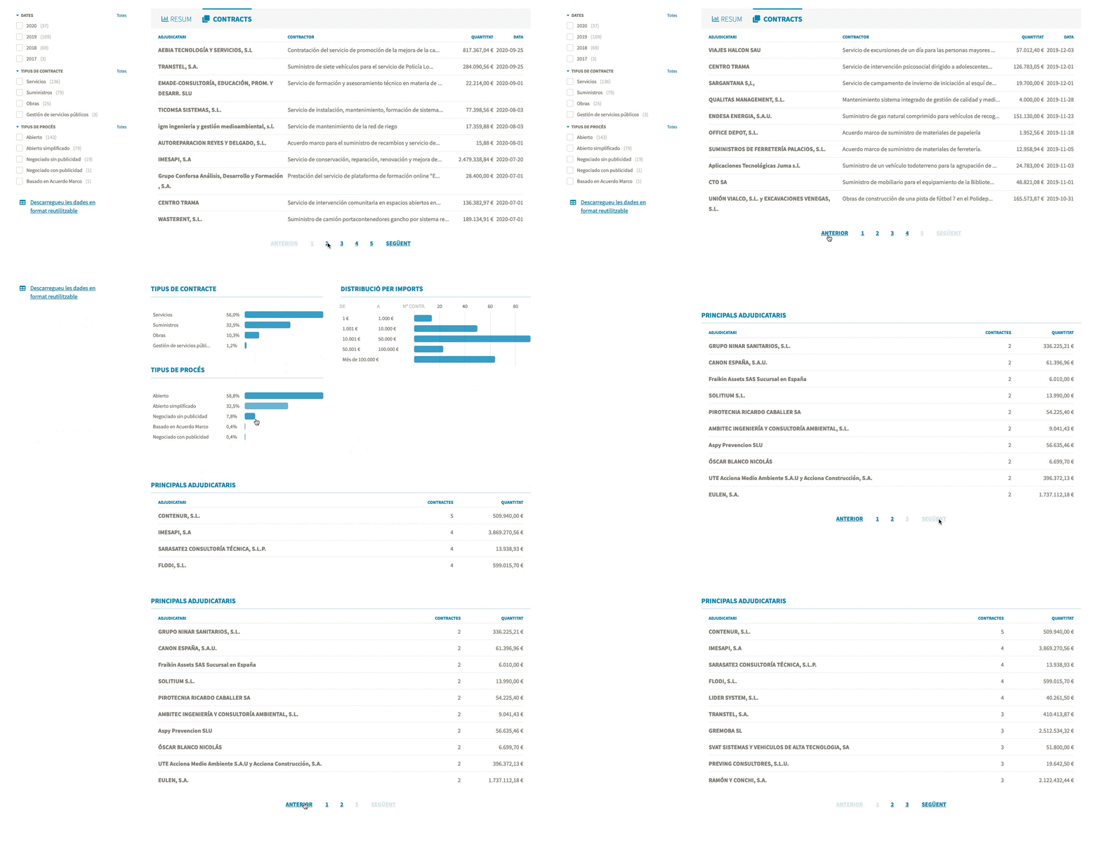
Creates pagination composed of a next button and a previous button, and a button to switch between each page.
Props
data: {
  type: Array,
  default: () => []
},
itemsPerPage: {
  type: Number,
  default: 1
},
containerPagination: {
  type: String,
  default: ''
}
data: Your array with the data.
itemsPerPage: The number of items to be shown.
containerPagination: This prop is the container where the paging is included. It's necessary for when the user clicks on the buttons, the scroll goes to the top of the container. Pass the HTML TAG element and the class or id. Example with css class: 'div.gobierto-data-header'. Example with ID: 'div#gobierto-dashboard-container'
Events
@showData="callback"
This callback returns the data to be shown.
How to use
  <Pagination
    :data="items"
    :items-per-page="10"
    :container-pagination="'your-html-tag-elememnt.your-css-class-or-your-id'"
    @showData="callback"
  />
Skeleton Spinner
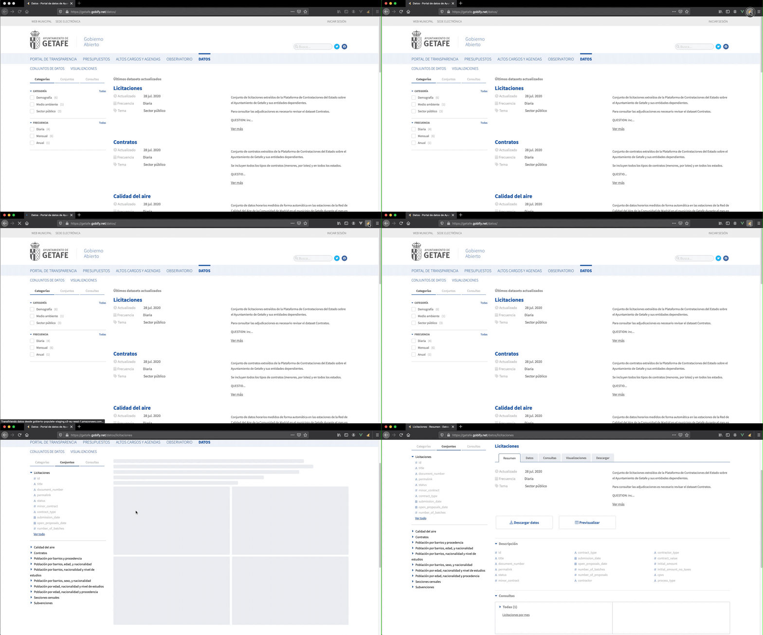
Show a loader that replaces the content while the data is loaded.
Props
props: {
  heightSquare: {
    default: '1rem',
    type: String,
  },
  squaresRows: {
    default: '1',
    type: String,
  },
  squares: {
    default: '1',
    type: String,
  },
  lines: {
    default: '0',
    type: String,
  }
},
heightSquare: Determines the height of the squares. Theefault is 1rem.
squares: The number of squares by row. The default is one..
squaresRows: The number of rows of squares you want to show. The default is one.
lines: The number of lines you want to show. The default is one.
Events
None
How to use
  <SkeletonSpinner
    height-square="200px"
    squares-rows="3"
    squares="1"
    lines="5"
  />
Text editable
Converts any element in text editable clicking on it and set it on enter key.

Props
  props: {
    tag: {
      type: String,
      default: "p"
    },
    icon: {
      type: Boolean,
      default: false
    }
  },
tag: HTML tag to make contenteditable
icon: Display an edit-icon
Events
@input="callback"
This callback returns the innerText of the tag element
How to use
 <TextEditable
    tag="h1"
    :icon="true"
    @input="handleInputTitle"
>
    {{ title }}
</TextEditable>
Autocomplete
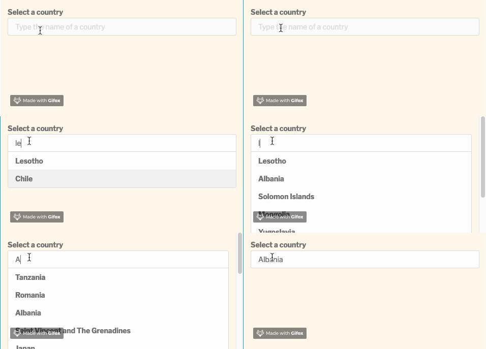
Implements a searching block with autocomplete results while typing. Values are provided from a plain array. You can use the arrow keys to choose results and enter key to select one.
Props
props: {
  label: {
    type: String,
    default: null
  },
  placeholder: {
    type: String,
    default: ""
  },
  name: {
    type: String,
    default: "autocomplete"
  },
  items: {
    type: Array,
    default: () => []
  },
  defaultValue: {
    type: String,
    default: null
  }
},
label: Add a text to the input box. If none, label is hidden.
placeholder: Add a placeholder to the input box.
name: Input box name. Useful to get the values after form submit.
items: Lookup array.
defaultValue: Preload a value.
Events
@input="callback"
This callback returns the current search string the user is typing.
@change="callback"
This callback returns the selected result.
How to use
Note the result markup could be edited, using the v-slot directive to get each result scoped.
// Simplest use
<Autocomplete :items="plainArray" />

// Edit the result markup
<Autocomplete
  placeholder="Type any country name"
  :items="plainArray"
>
  <template v-slot:default="{ result }">
    <strong>{{ result }}</strong>
  </template>
</Autocomplete>

// Edit only the label
<Autocomplete
  :label="selectLabel"
  :placeholder="placeholderLabel"
  :items="widgetsData"
>
  <template #label>
    <label>
      Different label markup
    </label>
  </template>
</Autocomplete>
Table
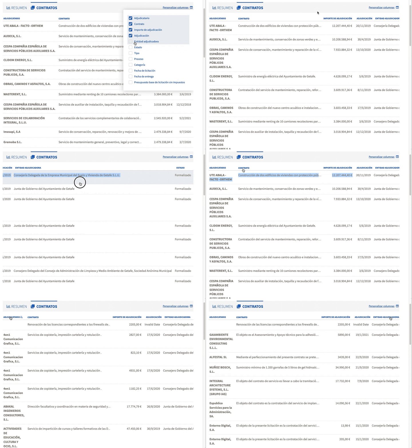
Create a table with pagination and a selector to customize the columns to show on the table.
Props
  data: {
    type: Array,
    default: () => []
  },
  columns: {
    type: Array,
    default: () => []
  },
  sortColumn: {
    type: String,
    default: null
  },
  sortDirection: {
    type: String,
    default: null
  },
  showColumns: {
    type: Array,
    default: () => []
  },
  showColumnSelector: {
    type: Boolean,
    default: true
  },
  showPagination: {
    type: Boolean,
    default: true
  },
  href: {
    type: String,
    default: 'href'
  }
data: Data for the table.
columns: It's an array of objects with the configuration of the table
sortColumn: To sort the table by a specific column
sortDirection: asc or desc
showColumns: To customize the columns you want to display by default.
showColumnSelector: Enables the selector to select which columns you want to show or hide in the table.
showPagination: Enables pagination
href: To provide a link to those tables that are clickable
Slots
The components have two slots, feel free to use them.
-
Pagination: Replace the default paginator component
<template v-slot:pagination="{ paginator, data }"></template>
paginator(newItems) is a function where you will update the items you're displaying
data is the current array -
Columns: use this slot is unlikely, but you may want to modify the column selector
<template v-slot:columns></template>
Events
When a table contains links we will have to create the route, for it, we have this event that receives the item that has been clicked.
@on-href-click="goesToTableItem"
  goesToTableItem(item) {
    const { id: routingId } = item
    this.$router.push({ name: 'contracts_show', params: { id: routingId } })
  }
Config
We need to provide a configuration file for the table. We will pass it with the prop columns
const exampleColumns = [
  {
    field: 'final_amount_no_taxes', // Pass the key of the data
    name: I18n.t('locale'),
    cssClass: 'right nowrap bold',  // Add CSS class to row
    /*Our data can be of various types.
    If it's a date we will use the type:'date'.
    If it's an amount we will use the type:'money'.
    It may be a string that we want to truncate. We'll use the type: truncate*/
    type: 'money'
  }
]
How to use
  <Table
    :data="items"
    :columns="contractsColumns"
    :sot-column="'final_amount_no_taxes'"
    :show-columns="showColumns"
    @on-href-click="goesToTableItem"
  />
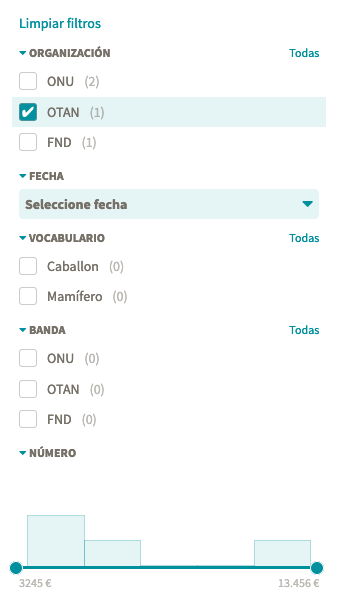
Filters
Create a common wrapper for the custom fields, who gathers all the required handlers to deal with each type of custom field. Current supports vocabulary_options, numeric and date.
Props
data: {
  type: Array,
  default: () => []
},
fields: {
  type: Array,
  default: () => []
},
metadata: {
  type: Array,
  default: () => []
},
stats: {
  type: Object,
  default: () => {}
},
noEmptyOptions: {
  type: Boolean,
  default: false
}
data: All the items you wanna filter. Usually comes from /api/v1/METHOD
fields: Array of the filters you wanna display. Usually an array of objects like { id: KEY }. Take a look at Inversiones configuration availableFilters property
metadata: Object fetched by the property data of the response of the /api/v1/METHOD/meta
stats: Optional. Object fetched by the property meta of the response of the /api/v1/METHOD/meta?stats=true
Events
@update="callback"
Every single time any filter is clicked, the data items will be filtered. So, this event emits which are the current items based on the selected filters
@clear="callback"
When the clear filters button is clicked, a simple event is emitted, in order to do something in the parent
How to use
<Filters
    :data="items"
    :metadata="metadata"
    :fields="fields"
    :stats="stats"
    @update="callback"
    @clear="callback"
  />
NOTE for vocabulary_options: the order of the displayed items come straight away from the API results, that means, they can be configured in the backoffice itself, where the terms for that vocabulary are set up. The same order displayed in the backoffice will be how they're shown in the frontoffice.
Updated over 1 year ago
